When it came down to the production of the folded leaflet first I tried out multiple different mock version to identify which fold would be most appropriate for the leaflet and then when I had decided which fold to take forward in to the next stage. After deciding the next stage was the designing at that was completed interlay though illustrator to create the vectors and type used in the design and then the aspects of the design were then organised and put together in indesign as I prefer to use InDesign for layout purposes as I believe it achieves the most professional result.
Due to the brief being such a small outcome and also being aimed at such a small target audience that being ourselves and other tightly linked graphic designers at the university meaning the production methods didn't need to be too expensive and professional as when it comes to leaflet printing this can add a lot added expenses to the production stages, where as the printing facilities we have access to in university will be enough to achieve the desired level of professionalism and inexpensiveness.
As we have the limitations put upon us that are we can only use the resources that we have access to in the college printing these leaflets could become a very costly process as we are printing small limited runs. In oder to be able to keep these costs down I decided to use a lighter weighted stock as this allowed me to keep the prices for the production down but also helped the folded leaflet fold cleaner which ultimately made it look more professional. In a more commercial context if I had access to more money and alternative process due to the fact that the whole design includes only one printed ink colour on a cream colour stock the whole production costs could be kept well down when printing a higher amount of runs by using a spot colour of which can save you a lot of ink and printing costs at a professional printers and also it opens the possibility that this leaflet could be printed through a one colour lithographic process. This would mean that for the solo one off price of the set up and plate production casts which usually results around £100 1000's of copies could be printed for a price as low as the ink and paper around £5. If this method was chosen extra post-designing stage considerations must be in place to ensure the single spot colour printing process goes smoothly but none the less this would be reasonably cheap to produce whether using CMYK or Spot inks due to its minimal nature.
Saturday, 3 October 2015
OUGD504 Studio Brief 01 - Development
The first stage of this was to design the background of which would serve as the backing to all the information on the leaflet. The background features a light blue colour included in oder to be reminiscent of colours representative of school and learning such as the similarity between the colour used and the colour iconically linked to the colour of biro's, and graph paper and more school based references making it the perfect point to start from. To finalise the background the decision was made to include a paper grain in to the designing stage to add further representation of the links to education and learning. This grain wouldn't be printed in to the final outcome of the unit but would actually be recreated though a grained stock choice but in the design it is only being used to represent what will be later included through stock choice.


As I was trying to represent my unorganised and unplanned design process through the leaflet in the main designing of the content I refrained from using any sort of grids so that it unconsciously represented exactly what was desired. Although I refrained from utilising a grid in to the design I did conform strictly with the margins of the page in order to retain some sense of professionalism while not using the grid.
To retain this representation of my design process I began by randomly placing the different questions that I had already outlined in preparation randomly on the page ensuring that they would all fit in to each page in some way and then each page could also be combined with the title of each step of the process. Some small editing of the position of these statements and title and I was ready for the finalising touches to the design.

The final touched to the inside of the leaflet were then all that was needed to complete the inside. To add emphasis to the essence of a flow chart that I was trying to convey through my design process leaflet I added some small additions. The first of these was a dotted line reminiscent of something seen through our educational career. The process was split in to five different stage of design and each included three different statements. Each statement had one dotted line going back to before that step of the stage and one dotted line that advanced on to the next statement signifying the progression from one stage of the brief to another. This was then further enforced by the small Y & N iconography to further reenforce the essence of achieving the stage and moving on from it, or failing on the stage and looking back at it and giving it another go.
The five different stages are then also linked between the full bleed images of which identified that when a stage of the process is finished for example research it was then time to move on to the next stage for example idea generation.

As the inside of the leaflet was very busy and hectic it was then decided that the outside would be kept somewhat simple to balance the inside. The typography used on the cover remained the font used on the front cover of the leaflet with the title that said "The Five D's Of My Design Process" and ensuring that the outside of the leaflets decisions such as the colour, typography and aesthetic style were kept the same to ensure a level of similarity and consistency throughout the design. The leaflet was finalised with the inclusion of my name on the back cover to shop authorship and finally another inclusion of the dotted joining lines to help promote similarity throughout the leaflet.


Friday, 2 October 2015
OUGD504 Studio Brief 01 - Font Decision
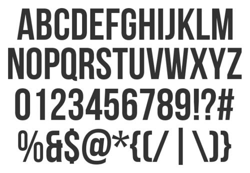
The next decision that had to make was what font would be best to use in the leaflet to display the text that was needed. As the decision had earlier been made that to create my leaflet in a infographic flow chart style, the decision had also been made that due to the fact infographic style artwork needs to display a very high level of information while still having an heightened visual sense to keep the attention of the viewer on the leaflet and therefore that the font type used on my final leaflet would have to be bold and eye-catching due to the fact that it needs to interest the viewer in to taking in the information. Below is a sample of a number of different fonts that were being considered to use for the leaflet;
BEBAS
TES BOLD

GOTHAM BOLD

ALFA SLAB

After taking all of these fonts into consideration it had cut it down to the two most aesthetically pleasing and most appropriately relevant design choices of which were Alfa Slab and Gotham Bold. Firstly Alfa Slab is an appropriate design choice as it fit my necessary requirement of which was a heavily bold. It was also an appropriate choice as it is some what reminiscent of a handwritten style due to the serif nature but it is possibly to far away from hand writing due to its overly heavily bold nature. Although the handwriting style was what was desired when looking for a font for the final outcome of the brief it was just too far way from it to be perfect for the design. This lead to me on to choosing what I believe to be the most aesthetically pleasing but also the most appropriate design decision and that is Gotham bold. The decision for this came down to the fact that it also fit my necessary requirement to be bold making it perfect for my infographic style leaflet as this will help convey the information effectively to the viewer but also was a lot more reminiscent to a handwriting style, not in the way of the last font mentioned with serifs to be reminiscent of handwriting but almost in the style that might be seen as something similar to bubble writing of a child due to its very circular nature. This decision was perfect for the choice of the final font as the handwriting style worked very well with the intended message as it fully displays the notion of educational, school-like and infantile look that was preferable for the design decision that I was looking for.
The bold sans-serif style help the information be effectively and clearly displayed to the audience.
Thursday, 1 October 2015
OUGD504 Studio Brief 01 - Colour And Grain Development
The next aspect that I had to decide on was the colours of which I would use on my final folded leaflet. During my research I outlined by looking at examples of work of which I am taking my colour inspiration from that in the world of design normally info-graphic style work is accompanied with bright graphics to keep the viewer focused.
I then decided then came up with many ideas of which I could use for the colour scheme for the leaflet the first of these playing on the earlier mentioned aspect that the more vibrant the accompanying graphic the more that it will help the viewer to keep focused and will convey the information better.
The first of these colour schemes was a scene very reminiscent of 3D technology of the past. The vibrant contrast of the over lapping of the very almost neon blue and red and when also contrasted again a perfect white page created what I believe to be a very eye catching aesthetic exactly what I was going for. Although the contrasting nature of this colour scheme perfectly fits what I wanted with the vibrant colours keeping the focus on the information I don't believe the colour scheme well enough fitted the brief and process side to the brief so it was back to the drawing board so to speak.


After thinking more in to the process of which I was displaying in my leaflet I started to think about the fact that the process seems very trial and error and not only this but the fact that I was almost through the leaflet teaching/informing and this led me on to altering the colour scheme mentioned above so that It linked more to the actual process in the leaflet.
I kept the vibrant blue nature of the work so that it would still remain eye catching to the viewer and effective in conveying information but scrapped the idea of the red as this in no was linked to the process at all. I decided to keep the blue instead of the red as after contemplation that the leaflet to to teach/inform I wanted to replicate this sense through the colour scheme and therefore chose to go with an almost school/learning orientated colour scheme using the blue as a feature on the lighter colour to be reminiscent of a blue biro on a page and this led me on to combining the blue with an off-white/cream colour of which is reminiscent of the page on which the brio would be. I believe this although subtle is a good link between the process and the colour scheme and in my eyes displays the pen on paper teaching sense I was looking for.
To further enforce this colour scheme and further enforce the links it has I decided that an additional grain would pull the whole thing together adding to the paper like aesthetic I was trying to display. Below you can see my finished background for the leaflet including the grain and colour scheme.

This colour scheme works well for my folded leaflet for multiple reasons firstly due to the fact that the leaflet is to be created and produced in university giving my limitations of what printing methods I could use in the production of my leaflet. The simple colour scheme allows it to be produced very efficiently and cheaply, due to the fact that the blue single colour ink used could be printed on a cream stock to give the effect of two different colours in the leaflet. This keeping the ink and stock prices down. If the limitation wasn't set that It has to be produced in university it would open up a much better method of production for a much more large production scale. This possibility would be opened up as due to the fact the leaflet only uses one single printed colour on a coloured stock it would lean itself to be produced through a one colour lithographic method. This would mean that for an initial cheap set up cost of production costs and printing plates, for around £100 set up costs a really high amount of copies could be printed for pennies per copy, making this a much more efficient way to produce a high level of prints cheaply and efficiently.
OUGD504 Studio Brief 01 - Feedback From Mock With Ideas
The next stage of the project was to take the ideas that we had generated about the style we were going to take forward in to the final stage of the leaflet and display this to a group of my peers a long side my conceptual ideas in order to obtain tome feedback that I could adapt my ideas on.
I informed the group about my plan to display my imperfect design process through the design process leaflet itself and the fact that I would do this by displaying my design process as a five step guide but in an info graphical flowchart like style thats shows the process of designing and tackling a brief that I believe relates perfectly to me as I often go back an forth within a brief even when unintended.
I explained that I was going to further emphasise this by adding extra effort and attention to displaying it through the actual aesthetic design style choices used in the leaflet by eluding to a some who educational background to the leaflet.
Finally I explained that I had chosen to use a horizontal roll mailer fold a this leant itself perfectly to displaying the step by step basis process that the content of the leaflet included and furthermore solidified this idea by the fact that when opening the leaflet will be use in the way that once the first stage of the leaflet is completed you unfold it another time revealing another stage until it gets to the final stage.
The final idea that I pitched to them that would be very important to me to display in the leaflet is that even thought the steps of the leaflet were still undecided it would be certain that there would be an inclusion of the question "why?" between every stage signifying the need as a designed after everything that we do during a brief to question why have we done it and only if we can answer this question may be move on.
OUGD504 Studio Brief 01 - Mock With Idea's
The first decision that needed to be made was the choice of which fold would be best and most appropriate for the leaflet and after taking a lot of aspects in to consideration the decision was made to use a horizontal roll mailer fold for the leaflet as this was a slightly more difficult folding style adding to the overall leaflet complexity but also is a very good choice for a folded leaflet in which a high amount of information needs to be displayed like in my infographic content making it the ideal choice.
The information in my leaflet due to my want to display a lot of information to the viewer but while doing this wanting it to be very visually and aesthetically pleasing so that this information is conveyed efficiently.
Now that I had decided the type of fold that would be taken forward in to my final outcome and the style in which the leaflet would be it was now time to mock up a quick version so that I could see how it will all work, this does not have to be to scale, just more used as an insight in to the decision I have made and whether they work well together.
OUGD504 Studio Brief 01 - Colour Research
Colour Research
I then looked back at the two earlier example of images of which use visuals along side the information in order to add an added sense of effectivity in the conveying of information along side a number or additional designs also showing this. From these I grasped one main thing to do with colour and that is that there is a heavy essence or the use of bright vibrant colours as I believe these bright colours help to display the information keeping the viewer interested. So although i have not decided what colours I will use I have decided that It would be most effective in my leaflet to use brighter colours to help the conveying of information. The bright graphics are used as a way to keep the eye focused on the information where as a more dull graphic could lead to the viewer becoming disinterested with the information.


OUGD504 Studio Brief 01 - Further Aesthetic Research And Final Decision
Although I had decided that I was going to use an info-graphical style in my leaflet or atlas that I would take inspiration from them but taking on the high level or combination of visuals and text to convey the information I don't believe a normal info-graphic will accurately enough display what I was looking for due to the nature that they don't use enough text in them so I then started to look at a way that I could include enough text/information that I could in the leaflet but while still taking inspiration from the combination of info and visuals so I then decided to look further into another style in which I would design the leaflet that would still combine these.
After looking again at my decided design process I finally came up with the idea that it would be effective for me to use a flow chart style graphic in my leaflet to convey the information. I came up with this because of the fact that one of the biggest parts of my design process is the fact that after everything that I have done I have learnt to ask myself why have I done that as I believe that If I don't have a reason to do something that I have done and I can't back it up with said reason that it shouldn't be done and this is perfectly displayed by a flow chart where every piece of information has a yes or no answer if the answer is yes to the question why? you can progress on to the next stage of the chart is the answer is now you go back to the previous stage and act again until you can answer the question why you did it.
Flow Chart
I decided that I would use a flow chart for the final aesthetic choice when it comes to the designing of the leaflet as while still displaying the high sense of importance to information and doing this effectively, still combining this with a heavy effort on the visual side of the leaflet to add ease of the grasping of information for the reader and finally this gave me the final aspect to the design of which the regular infographic didn't display of showing a very regimented and linear sense of following the stages while still allowing the fact that it is a flow chart which shows the overlapping of stages and more importantly links to the actual design process within the content because it allows for a a jump back a stage is the stage isn't finished correctly which will allow me to display my why? section of the process.


OUGD504 Studio Brief 01 - Leaflet Content/Aesthetic Research
Now that I had decided the type of fold that I would use for the leaflet I now had finished the physic side to the leaflet the next thing I have to decide is the aesthetic style that the information will be displayed like in the leaflet so I will look at a few different types of way that I could display the information in the leaflet. There is two different main style in which I believe I could display the information. Due to the fact that I decided the leaflet would be a very information based non minimal stage orientated leaflet I decided that I could either display the information in a standard hierarchal way putting all the effort into the display and layout of the type and then accompanying this with appropriately linked graphics, putting the emphasis into the layout of the leaflet and information or I could go almost the opposite direction and choose two combine the two aspects of the last style together and display the information within the leaflet in a info-graphical way.
Layout Focused Style
The first style I looked at was a way in which most leaflets as normally displayed. The masses of information in the leaflets are displayed along side a series of appropriate graphics giving these leaflets a high sense of order, function and layout. This is a widely used technique in the world of leaflet design and is an effective way of displaying information while still adding a sense of design of which is necessary to pull the whole leaflet together


Info-Graphical Design
The second style of aesthetic choice I looked at was info-graphical. I decided to look at this style as similarly to the last style it is a method of which to display a high amount of information in a leaflet like i am looking for in my final leaflet but while combining this effectiveness with a visual side to the leaflet. The combination of these two compared to the separation of them in the last example can be very beneficial as the graphics used in the leaflet are there no longer as a added visual side along with the information but are used in conjunction with them to improve the was the reader will take in the information, making this another really effective way that instead of being a side aspect the visual side to the leaflet can help how the informational side is delivered.
After looking at these two different styles of information and visual communication I have decided that I would much prefer to use an info-graphical method in the creation of my leaflet as yes they bother are very effective in the way that they display information I believe that the combination of information and visuals rather than the separation of these things will be very beneficial for my leaflet as I believe the combination allows the information to be passed on the reader much more easily where as I find that most people believe in the other style where the graphics and information are separated people find often an inappropriateness of the graphic in the style and the excess in information without the visuals easily leaves people disinterested.
OUGD504 Studio Brief 01 - Feedback From Leaflet Decision
I ran a small informal feedback session with a few of my classmates in which I discussed my final choice to use a horizontal roll mailer folded leaflet and informed them that because of my limitations with what I could create and the fact that the design process is so in depth that I was looking for simplicity but high effectivity with holding information and finally that I wanted the leaflet to display the sense of a linear step my step system and then asked them to comment back on whether they believe that due to the information i have give them I have chosen the right style of leaflet fold or if they thought another style would be more appropriate.
The feedback that I got from the group was brilliant as they had agreed with such an emphasis on the above mentioned desirable aspects I had picked a perfect fold for the leaflet and agreed that if the emphasis is on the information and process a much more intricate type of fold for the leaflet would just be inappropriate and overly confusing and they really liked the idea that the leaflet displays even without the information actually on it the stage by stage process described in the content of the leaflet.
OUGD504 Studio Brief 01 - Chosen Fold and First Mock Up ADD IMAGE
It was then time to decided which fold I would take forward in the project and use for my final leaflet and I can to the decision that I would use a horizontal roll mailer folded leaflet. The decision to use this fold for my final leaflet was hard as there was a lot of other simple and effective information holding leaflet folds that I discovered but I decided that the horizontal roll mailer was definitely the most appropriate.
i came to this decision because of the fact that yes even though it also is simple and effective like the other folds and while still holding the mass of information in such a manageable pocket size like the other folds it stood out to me with the way I thought it best represented the design process that it would hold in its content as out of all of the fold types I have looked in to it most represents the linear step by step feeling from the design process due to the fact that after the cover of which encapsulates the whole leaflet it is then unfolded one by one releasing one stage of the process at a time further reinforcing the feeling of when the first stage is completed the second stage can then be opened and started!
I then decided to recreate a very rough initial mock up of the folded leaflet that would hold no information and only act as a means to see how the end product would work, this helped me as it allowed me to se where on the leaflet the information and the cover will be placed and further helped me realise that due to my five stage design process I would need to create a six section net to then be folded into the leaflet.
OUGD504 Studio Brief 01 - Research Into Folds
Before making decisions on which type of fold to take further in to the next stage of the process and ultimately use for the fold of my final finished leaflet it was time to partake in some further research into all of the possible folds that could be used. As the decision has been made that the process of design is split up into the five main section but also that there is linking between the stages it was necessary to pick a type of fold of which allowed me to follow an almost linear order but also allowed for some over lapping in the sections and finally made the decision that due to the fact the leaflet will be made in the same style of my actual design process I have considered my limitations when it comes to how the leaflet could be printed such as the limitations of printing methods accessible to use it would be preferable to keep a sense on simplicity to the leaflet and therefore looking for a fold that fits the process appropriately but is also not over-complicated is very important for this design.
I found the image below of which is a display piece from a professional printing place to display the types of leaflet folds that they offer for printing, I thought this would be a good image to look at as because of the fact that its a professional printing place it gave to me an insight into what is usually used for leaflets almost whats the industry standard. As these are the industry standard they are more on the simple side as they aren't for anything special just for your standard leaflet printing meaning they will be fine for me to try and replicate for my leaflet.

We were showed a website called fold "factory.com" so I decided that I would use the website to learn more in-depth about a few more types of fold that I could possibly use for my leaflet.
Accordion Fold
The first type of fold I decided to look at was an accordion fold of which is really a simple fold for leaflet that would mean it would be easy for me to recreate. The accordion fold would be a good choice for my leaflet as it is a very simple fold but also due to the nature of the shape of the fold it to can hold masses of information while still being able to fold up to a very small and compact shape. The accordion shape although simple can be made more intricate by adding a few different aspects to the fold for example it can be measured so the folds of the accordion form a stepped leaflet like in the image below. This can be further changed by adding a wrap around on the end of the stepped accordion.


Closed Gate
The next fold of which I looked in to is the closed gate fold where the page is split into four vertical sections these are folded from the outside of the paper into the centre to create what is already known as an open gate fold but to distinguish it the outside are then folded together so they are touching to turn it into a leaflet that would initially open like a book and then once opened once then opens like and open gate leaflet.
This is yet again another simple fold for a leaflet that would be reasonable for me to recreate but also allow enough space in the leaflet to display detailed information on unlike some of the more intricate folds of which in my eyes don't hold enough information for the need of this brief.


Horizontal Roll Mailer
The final type of fold that I decided to take a more in-depth look at is the horizontal roll mailer fold. I decided to look at this fold as this was yet again another simpler fold of which allowed ease of recreation when I get to the stage but also a fold of which is in my limitations with printing and shape while yet again allowing me to display a high amount of information of which I believe is necessary for the nature of this brief.
The fold works by folding the decided width into an amount of sections, e.g 4 in the pictures below, the divided sections are then folded one at a time from right to left leaving the last section to be folded round left to right to create almost a cover for the leaflet.


Subscribe to:
Comments (Atom)