The next decision that had to make was what font would be best to use in the leaflet to display the text that was needed. As the decision had earlier been made that to create my leaflet in a infographic flow chart style, the decision had also been made that due to the fact infographic style artwork needs to display a very high level of information while still having an heightened visual sense to keep the attention of the viewer on the leaflet and therefore that the font type used on my final leaflet would have to be bold and eye-catching due to the fact that it needs to interest the viewer in to taking in the information. Below is a sample of a number of different fonts that were being considered to use for the leaflet;
BEBAS
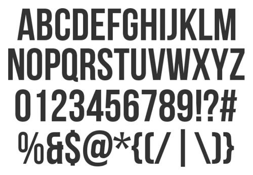
TES BOLD

GOTHAM BOLD

ALFA SLAB

After taking all of these fonts into consideration it had cut it down to the two most aesthetically pleasing and most appropriately relevant design choices of which were Alfa Slab and Gotham Bold. Firstly Alfa Slab is an appropriate design choice as it fit my necessary requirement of which was a heavily bold. It was also an appropriate choice as it is some what reminiscent of a handwritten style due to the serif nature but it is possibly to far away from hand writing due to its overly heavily bold nature. Although the handwriting style was what was desired when looking for a font for the final outcome of the brief it was just too far way from it to be perfect for the design. This lead to me on to choosing what I believe to be the most aesthetically pleasing but also the most appropriate design decision and that is Gotham bold. The decision for this came down to the fact that it also fit my necessary requirement to be bold making it perfect for my infographic style leaflet as this will help convey the information effectively to the viewer but also was a lot more reminiscent to a handwriting style, not in the way of the last font mentioned with serifs to be reminiscent of handwriting but almost in the style that might be seen as something similar to bubble writing of a child due to its very circular nature. This decision was perfect for the choice of the final font as the handwriting style worked very well with the intended message as it fully displays the notion of educational, school-like and infantile look that was preferable for the design decision that I was looking for.
The bold sans-serif style help the information be effectively and clearly displayed to the audience.
No comments:
Post a Comment