Studio Brief 02 - What is a book?
| Module ID: | OUGD404 | Module Brief: | - |
| Module Leader: | Amber Smith | Module Deadline: | 22/04/2015 |
| Brief Deadline: | 22/04/2015 | Outcomes Assessed: | A45, AB4, AC5, AD4 |
Studio Brief
Produce a set of 10 Double page layouts that explore the form, function and construction of a book.
Your ongoing visual investigation of content should demonstrate a growing understanding of the fundamental principles of type, grid, layout and format that will (and have) been introduced during studio sessions and workshops. Use these as a staring point to develop a set series or sequence of page layouts that effectively communicates your chosen content.
Your 10 layouts should include a contents page and introduction to the content.
This brief will be supported by talks and workshops. |
Background / Considerations
As designers it is your job to help the reader read the words by positioning text and images in such a way as to be appropriate for the content but also navigable by the human eye. This is true for any layout whether it’s for a glossy fashion spread, reportage or an instruction booklet.
To be creative but effective with type it is essential that you have a clear grasp of the fundamental principles of type composition. It’s great to break the rules but learn them first, understand what you’re looking at and make informed design decisions
Start by producing mini thumbnail compositions to your chosen layout on layout paper with blocked-in positions of type and image giving consideration to the possible underlying grid. Using markers, felt pens etc, greek-in to render your layout so it has the weight and impact of an actual print. You are aiming to simulate in miniature how it would appear if actually printed.
You should produce work through drawing and specifying layouts and making blog entries that demonstrates that you understand the following:
Grid Sub-heads DPS Rules & Boxes
Columns Paragraphs Drop caps Folio Numbers
Gutters Images Headlines Pagination
Margins Captions Measures Imposition
How do you best demonstrate all that? First check what the words mean and design a layout that includes much of, but not necessarily all of the above.
As a body of work you will have a de-constructed mark-up of an original layout, New thumbnail layout ideas, and a drawn, full scale dimensioned new layout.
. |
Mandatory Requirements
| All practical development and investigation should be documented on your Design Practice blog and labeled OUGD404 plus the relevant task number. Any research in to contextual references relating to sessions, tasks and briefs should be posted to your Design Practice blog and labeled OUGD404 plus the relevant task number (where necessary).. |
Deliverables
A set series or sequence of 10 page layouts that effectively communicate your chosen content.
A body of development work produced in response to set tasks documented on appropriate blogs. This should include evidence of thumbnails, test pieces and trial layouts produced during the development of your final resolution.
evidence of independent investigation into Design principles of Type, Image, Layout, Composition and Colour as briefed.
For the first part of this brief to help me get up to scratch with the terminology of some of the above suggested book layout components I am going to research the terminology and accompany them with an example as I believe this will get my understanding of this area of design to as high quality as I can...

The image above displays a number of the outlined layout terminology;
Grid - In graphic design a grid is a structure made up of a series of intersecting straight (vertical, horizontal, and angular) or curved guide lines used to structure content.
Column - The columns are the vertical sections of the grid layout in which image of text can be placed, between each of these rows their is a space of which we call the gutter.
Row - The rows are the horizontal sections of the grid layout in which image of text can be placed, between each of these rows their is a space of which we call the gutter.
Module - The modules are the areas of which text and image can be placed in from the grid, their creation coming from the overlapping area of the columns and rows.
Gutters - The gutters are the spacing in between the columns and the rows.
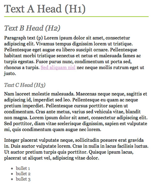 Paragraphs - Paragraphs are a collection of sentences that are put together and is a distinct section of a piece of writing, usually dealing with a single theme and indicated by a new line, indentation, or numbering
Headings and Sub-Headings - Headings are usually a certain piece of text of which usually need extra exaggeration to the majority of text and sub-headings are similar to this but are usually smaller than the heading as this information is not quite as important but due to the face it is more important with the body of text it is usually in some way more exaggerated than the nody copy. This can be done simply through a hierarchical nature by having the sub heading a bigger point size to the body copy and then the heading even bigger, or simply through the use of additions to the text sic as italic or making it bold.
Margins - Margins are the spacings around the outside of the rows and columns.
Images - Images are a picture of some sort whether they be a vector image created through a computer to a photograph and A representation of the form of a person or object, such as a painting or photograph.
Captions - Captions are small snippets of information used in book design that will be partnered along with something else such as an image or quote and may in some way have an emphasis effect used on them such as bold or italics.
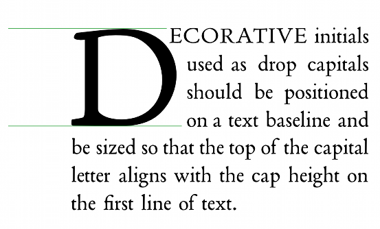
Drop Caps - Drop caps are special oversized capitals that are used as the first letter of a paragraph, they always span at least two or more lines, this technique is a very traditional style usually seen in a lot of older books.
Rules And Boxes - Rules and boxes are tools that are used when designing a book for aligning pieces of information.
Folio Numbers - Folio numbers is just the technical term in the printing world for the numbers on each page.
DPS- DPS is just an abbreviation of a double page spread in a book.
z
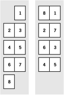
Pagination - The system by which the pages in a book are arranges, as noted in book a catalog or bibliography.
Imposition - Imposition is one of the fundamental steps in the prepress printing process. It consists in the arrangement of the printed product’s pages on the printer’s sheet, in order to obtain faster printing, simplify binding and reduce paper waste. This is needed as in the designing software such as indesign the pages are viewed in double page spreads imposition is needed to rearrange the pages so that the pages are in the right order so they print correctly in the book because of the fact the pages are printed on both sides of the paper.
Research The first and most inspirational form of research I found was a relatively new magazine called Brick of which is a brand new magazine of which all of the content is surrounded around the Hip-Hop and rap music genre but the reason that this magazine is inspirational for me in the creation stage of this book is because it is the first Hip-Hop based book that I have seen not only to provide the content that people are looking for in the book but also to design the magazine with graphic design principles in mind, seemingly following these principles and over all making the magazine very eye-cathcing to me as when looking at it, it is evident that the design process had been throughly thought about and this has worked very well for the magazine. Although this isn't on the scale that I am going to make mine at as it is a very professionally designed magazine although it is a very goof insight into the sort of style in which I will design my final outcome. 
The second point of research of which I did was looking at a skate magazine of which I found in the Village Book Store. Although this magazines content does not surround itself in the world of Hip-Hop this part of my research was more a look into the way I was going to design my book. This is an ideal piece of research for my book as it is just the professionally but not commercially produced magazine aesthetic that I was looking for in my final outcome and it was found in the ideal location that I would expect my final outcome to be sold in such as independent bookshops. Looking through this book allowed me to have an insight into the style of design of which I was looking for.

For the final part of my research I decided to look at another pre-existing and very very successful Hip-hop magazine called XXLMag. I look at this as I wanted to take aspects from this mass produced and commercially made magazine and by looking at this I could easily see the design ideas of which they choose that I don't like and It would help me to change totally how these double page spread styles are designed to totally change the aesthetic to the way I want my book to look.
 Design Generation Stage
Firstly I had to decide what the content of my book was going to be about and I knew that the choice of content was all up to me and the only criteria that I actually had to meet was that I needed to have enough writing that meant I could fully show my knowledge of the terminology linked to this style of book design but also I didn’t want too much content as this may mean negotiating on quality to fit all of the content in. So therefore the easiest way to do this was to write all of the content myself meaning the next stage was choosing my content. I finally decided that the content of my book would be the history of American Hip-Hop throughout the years. As the content was of my choice and I was writing it all by comprising it from a lot of different sites on the internet I made the book personal to myself by picking 10 of my favourite Hip-Hop artists from the USA over the last thirty years. The reason I decided to write about ten different artists and do a double page spread on each of them therefore ensuring that my book will be a minimum of 20 pages, realistically more as the content will be surrounded by other pages.
Now that I had decided what the content of the book was going to be about and had wrote all of my content it was now time to start thinking of what way I was going to design the book of which would hold the content.
After a lot of though I finally decided that I wanted to display my content in the style of a small independent “Zine” style book that you might see in an independent bookshop created by a independent producer. I decided to do this as even though there is a lot of current magazines writing about Hip-Hop culture there are only a few of which appeal to me from a artistic sense and further more even less that look like that have been designed with graphic design principles in mind. Now that I had decided this style I decided that during the design process I would always have three things in mind MAKING THE WORK LOOK PROFESSIONAL while still being COST EFFECTIVE and HAVING A HAND MADE AESTHETIC.
After decided in which style I was going to design the book in I then decided I would create the first mock for the module and I decided that I would make a mock up of the booklet to plan for the placement and arrangement of my content (text and image). I wouldn’t put any actual content in to this mock up of my final outcome it would just be used as an initial planning stage and to help me with the working out of an applicable grid that I could use for the book and the amount of text and images I would need for the book. This would be the first of many different mock ups that would be involved in design stage. I then created this and made the first plan for my final book.
I had initially decided that due to the very in your face nature of the content and the fact I had decided to use a minimal modernist layout style I though to keep in context with the content I would use an in your face bold font, initially experimenting with BEBAS, but coming to the conclusion that it wasn’t to my liking so I then decided to use GOTHAM BOLD instead. I hadn’t thought much about colour at this stage but knew i wanted to keep it quite minimal in colour.
For the first crit I decided to take with my finalised style and layout idea and my mock to show an example of the placement of my content. My peers said they loved my idea of creating a cheap and homemade zine for minimal money but at the same time through stock and design make the zine look clean and professional. I showed them the mock with hand drawn sketches to show the style I was going to place content in to my peers.
For my book as I had written the content myself and it was about something of which there was no way I could have taken pictures of the people myself I decided to source my images from the internet but only using images of the highest quality to ensure no pixelation in the book. I decided that for the designing process to give the aesthetic I wanted that I would have to use a grid of which was 6 x 6 therefore allowing me a lot of room for moving around and placement of the content of my book.
I then decided to design all of the of the pages of the book following a the six column by six row grid system with small margins, placing all of my text in the overlapping sections in the middle of the grid in a two columns structure following the grid lines strictly. This worked well as it displayed the minimalist and modernist style I was going for and was very easy to do as I wrote my own content so I was able to keep all of the information a uniform length or words and with small tweaking manages to get all the sections of body copy uniform.
I then decided to place the folio numbers for the book in the bottom right section of the page aligned to the corner of the grid. I finally finished off my layouts by placing the images and managing to remain in the area of modernist design.
I aligned them along the grid lines of the six by six grid and then also took into context aligning them with different aspects of the body copy page on the other of the double page spread.
The next stage of the design process was to now decided where the inclusion of colour would come in to my book because with just the full colour images alone the book was looking a little too bland in colour. I finally came to a decision on the colours after a while of playing with colour on the front cover by deciding to include the other colours of the american flag into the design minimally to be in keeping with the content of the book, I changed the year in the title of the book and then continued on this use of minimal colour throughout the book uniformly making the header of the double page spreads all blue and the folio numbers red. This finishing the design stage of my book.I then set about deciding the final way in which I would bind the final copy of my book. I had already decided that I would bind it with a saddle stitch, but when I first experimented with the saddle stitch we used a three hole saddle stitch method but this was too simple so I decided after some research into way that I could improve this binding method that I would instead use a five hold saddle stitch first to add a little but of difficulty to the stitch and give it a more professional feel but also to add a bit of extra stability and structure to the binding. The next stage was to print off a the finalised black and white mock of my book just so I could practice the completion of the binding, after taking this to the binding room I found that I was comfortable with this binding method and so then it was time to print off my final completed version of the book. I used the zine style specialist printer of which is a cost effective way to print as it is cheaper to many other methods and I printed it on A3 paper and then cut it down to the A4 double page spreads, A5 individual pages. Finally folding all of these pages perfectly in half with a folding bone. For my stock choice I decided as I was creating a book and more importantly using a stitching method that requires me to stab holes through the paper due to the amount of pages that were in my book that I would use the cheapest stock of which was also the thinnest that I could possibly use but making sure the stock is still of a good quality so this left me to have a choice between a good quality of paper of which can be put through the zine printer in the weights 90gsm and 120gsm and I eventually decided on using a 90gsm good quality paper. As I wanted to keep in line with the clean modernist feel to the book I decided to use an Ice White coloured stock. Finally to finish off the final outcome of this Studio Brief 2 I bound the book with the same earlier discussed binding method. I was over all very pleased with how the final version of my book came out. The printing and binding stage had gone flawlessly giving the book a very prominent professional look to it and when looking at the book as a whole I was very happy with how the design stage had gone, the minimal colour scheme that was in keeping with the content of the book looked very good and the design style was giving off the very minimal and modernist style I was looking for. I managed to achieve all of this while still keeping the whole printing and manufacture stage of the book to just under a spending of £3 making it perfectly in-fitting with the professionalism but cost effectiveness of the book making it perfect for the sort of nicely designed zine of which someone could make themselves at home for cheap production price but still making it look professional meaning they could sell the zine in placed like independent book shops for people who are looking for the content but also like nice design styles in the books they read. We had the final crit for this module in a different style to usual as we were asked to write down four question on a large >A2 sheet and people walked around and looked at the book and then answered the questions... My questions that I asked came in two halves and here they are; 1.) I wanted to create a book of which can be made cheaply in terms of binding and printing and made to be in-fitting with a home made aesthetic, does the printing and binding method work with this? 2.) With the last question in mind, and for the very small production price I paid for the book, do you think I have still managed to achieve a professional looking "Zine" for a small amount of money? and 3.) Do you think the clean modernist aesthetic is too far away from the possibly darker "Gangster" vibe content of the book? 4.) or... does the colour scene bring enough link into the content allowing the use of the modernist simple aesthetic? The overall response that I got in this feedback was brilliant! although some (but not many) had slightly negative comments of the book such as possibly the aesthetic is a little to clean for the content of the book and that possibly it could be a little more expressive to match the content the vast majority of the feedback I got was very positive of the book. The overall general verdict and theme that came back from the feedback was that the printing and binding method that I had chosen to use to keep the cost down had worked perfectly and were very good for the money spent and that that minimal spending couples with the fact that the book looked professional for the money spent perfectly achieved the professional "zine" style I was looking for. Finally from the last two questions I grasped that my peers thought that even though the content of the book has somewhat a darker more expressionist feel to it that because of the specialist look I was going for the simplistic style still worked for the designing as there was enough of a link to the actual design of the book and the content by using the colour scheme. Overall I am more than happy with how the book has come out the only change I might have made if I had more time would be a bigger variation of the body copy used but this isn't too important as this unit isn't marked on the basis of the content but on the design of the book.    |
No comments:
Post a Comment