Studio Brief 04 - Reflective Practice - Speaking From Experience
| Module ID: | OUGD406 | Module Brief: | Click Here |
| Module Leader: | Simon Harrison | Module Deadline: | 01/05/15 (14:00) |
| Brief Deadline: | 27/04/15 (09:30) | Outcomes Assessed: | 4A7, 4B6, 4C8, 4C9, 4D6 |
Studio Brief
Produce a graphic response/ graphic product /piece of work that makes a statement, comment, observation or gives advice about your experience on your first year of this course.
Work with any appropriate media or format and develop and identify the content will be entertaining, advisory or informative.
|
Background / Considerations
Think about the new experiences that you have had, the difficulties that you have overcome and the new people you have met and the life skills you have acquired this year.
Remember what it was like starting your first week, how did you feel and what emotions did you experience? Excitement, trepidation, fear or did you feel overwhelmed. You might have benefited from some advice, opinions and insight from others that have experienced the same transition.
What might you say, do or give to next years graphic design students to make the transition into the student experience, particularly this course more welcoming?
|
Mandatory Requirements
Enjoy the process of reviewing your year.
On going documentation on your blog.
. |
Deliverables
Design development sheets, support work and notebooks.
Resolved design solutions in a format and media appropriate to your ideas.
Rationale and evaluation.
For this brief my understanding was that we were to think about our year that we have just experienced and we were to pick something from the year that we had experienced and then were to create a resolution to fix the problem! and for this brief me on Tom Hodkin decided that we would do a collaboration brief between us two. We decided to re-write the brief for our project to help us with a starting point;

We decided that we would take an experience from the past year of my life because for atleast the first four months that I was in leeds I didn't know where I could go for certain things such as to but some new jeans or to get a bite to eat in the city or even to go for a drink somewhere so I avoided going into the city in the day time for a while as I didn't know where anything was and from this we decided to create a pocket sized fold up booklet that would have information and address' of different spots in leeds for shopping, food and drinks and these would also be on a map on the revers side, this would all fold up from A3 to A7 into a pocket sized guide.
We drew up some sketches as the first initial mock up of what the design would look like so we coud work out the order of in where the information would be placed and to help us with the text layout and to in-vision the map and finally how it would look folded up.
  
For some research we looked at different maps that we found on websites on the internet such as pinterest and found two different maps that we thought would be good to look at and analyse and here they are below;
 
The first of the maps is perfect for the style of illustrated map we were looking for but we thought the excess of detail made the map too confusing so we would so it in this style but keep it a lot simpler than the first one but the first map did get us thinking because it made us realise that for the distinguishing between the rest of the buildings we could do it through illustration, colour or typography. The second map is closer to the aesthetic that we were looking for and its simpler nature looked much better than the first one and we really like the simple use of a majority single colour. This second map used the method of illustration to show the designated spots but we didn't like this so we decided that we would do it in colour.
We decided that the layouts for the information side would include the front cover and then also would include 15 pages of information of which all include the name of a place, the address of it, a description about it and also a picture of it.
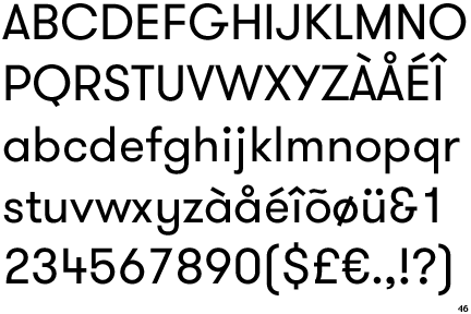
 We also decided to use the typeface Jockey for the headings of the body copy and then for the actual body cope we would use GT Walshiem. We also decided to use the typeface Jockey for the headings of the body copy and then for the actual body cope we would use GT Walshiem.
We then started to mock up some layout designs for the information side so that we could begin to grasp how everything would be placed and to help us play with the layouts;
    We then decided to scrap this and start the layouts again now working with a strict but simple grid to align everything to and the played around with the information until we were happy with the final layout, we got some of the information such as the address' from the internet but for the information sections we had to generate the content ourselves. Now entering the information we had wrote and adding in title in the heading font the final layout was finished. We then decided to scrap this and start the layouts again now working with a strict but simple grid to align everything to and the played around with the information until we were happy with the final layout, we got some of the information such as the address' from the internet but for the information sections we had to generate the content ourselves. Now entering the information we had wrote and adding in title in the heading font the final layout was finished.
We then started editing these 15 different A7 information pages into a four by four grid on A3 leaving one A7 page for the front cover of the booklet.
The map was created by getting a screenshot of a google maps shot of leeds centre big enough so that the map fit on all of our locations and then we illustrated the map in illustrator and marked in where our specific locations were so that when we had decided the colour and style of the map we could finish it off.
For some more research that would tie in with the style of the whole piece we decided to look at this below publication and draw some points from it, we found the image and it stood out to us as we really liked the single colour scheme that had been used throughout the booklet and although we didnt want to also follow a single colour scheme we really like it that much we decided to take a very prominent use of a single colour and then add in minor additions of another colour to finish the piece off.
   
In the end after doing a small crit like group discussion and asking them the question "what colour represents Leeds in your eyes" the majority of the answers we received were blue for multiple reason such as football and so on... so we decided to go with blue. After some trial and error we decided to finish off the poster with the addition of a grey colour to go alongside the majority of the blue and now we were ready to finish of the main piece. We finished off the map side with the addition of the blue colour in the building of the map of which aren't important and finished this section with a striped fill pattern. We decided to set the important locations in a solid grey fill so that they would stand out over the rest of the buildings. Finally we finished off the map side of the booklet by adding on the numbers on to the buildings in white so that they stood out against the grey fill and then adding a corresponding key telling the viewer which number is which place and colouring these in-keeping with the grey and blue colour scheme.
   Now that we had decided the colour we were going to use we could also finish off the information side of the brief of which we finished with the same colour scheme, also adding a single colour blue picture style too to finish off the design; Now that we had decided the colour we were going to use we could also finish off the information side of the brief of which we finished with the same colour scheme, also adding a single colour blue picture style too to finish off the design;
For a production method due to the nature of the design and the fact that we had stuck to only a two colour colour scheme we had a look in to getting the final outcome printed by a risograph machine of which we could get it printed locally in Leeds, risograph machines work very well for a limited colour design like ours and use a printing method similar to screen printing but incorporated this into a digital printed meaning it remains cheap to do like screen printing is but is also very speed coming from a digital method. We looked into the pricing for this and found that we could have printed 50 A3 two colur double sided prints for £48 making the production price very cheap and we took this information into the first crit with is. a risograph machine produces work like the image below;

From the first crit that we got we got a very good response, the overall response from the crit was brilliant the only negative comment we got was that the cooer scheme looked slightly sad or dull but we liked it and it had very strong links to the content in context with leeds so we decided to keep it. The rest of the comments were very good the group and tutor thought that the idea was brilliant and that it 100% fits in with the brief as we had drawn it from and experience from our own lives. They like the design choices and the overall aesthetic and said with minor tweaking would be perfect.
Even though the risograph option was by far the cheapest option we could have took due to the nature it can only be done in large runs and we only needed the two copies of it that it wouldn't be as appropirate to use for this brief but definitely should look into that method for use in future briefs and therefore we decided that we would use the digital resource room to print it as it is still cheap and more appropriate for the level of copies we would need.
During the crit we also showed our peers a list of name that we had come up with and from the feedback we decided to go with "About Town" as our peers said that this slang like approach most appropriately fitted the nature of out design, the nature of the content but also the nature of our audience, 18 year olds starting graphic design next year.
From this it allowed us to start creating the final front cover that we had left room for on the information page. We started the designing process by creating a grid for the page and then placing onto the cover the letters from "About Town" and also the silhouettes of the destinations on our map strictly fitting to out grid for the cover. We decided to include the use of the silhouettes as without it the front cover looked too bare so we decided it needed some more feature illustrations to finish off the design. We designed the front cover in-keeping with the colour scheme throughout the booklet and finished it off with an aligned tagline saying "15 of the best spots about town in Leeds"

The last things that we brought up in the brief as we wanted to ask out peers and tutor what they think about the idea was that should we design a supporting sheet of which would be packaged with the main map but using a belly band of which has blank template of which a possible next year level 5 student could use to write down the information of a place of which they have found themselves and to design this in an in-keeping style with the rest of the the final outcome and therefore we designed this;

For the final stock choice we decided to use a stock of which was still of good enough quality but is actually the thinnest one we could possibly use due to the fact that the booklet needed to be folded and the thinner the paper the more professional the final outcome would look when folded up, we decided on an ice white 90gsm paper and this would still allow us to fold it perfectly but was still up to the standard we were looking for and then we printed off the two final versions and put them together;
  |
No comments:
Post a Comment