Canon are grid like systems, methods or approaches to graphic design, most specifically relating to the world of editorial and layout design and advise on ways to organise type and image in said editorial design to create the perfect layout by applying a certain set of principles that allocate page proportions, margins and type areas. Canons can be very helpful in professional practice and can apply to both the areas of book design/editorial design and even helpful in web design. Examples can be seen in the modern day practice of typographers and editorial designers both professions using these principles to help with every day work tasks. Although they are very helpful in a designers modern day practice they can also cause total complacency and ease of use without a designer even thinking whether it is the best decision, an over-willingnedd to follow it blindly can become a hindrance to ones progression.
The first of these that we have look at is The Golden Ratio. The Golden Ration is a ratio represented by the letter "Phi" and is literally calculated by 1:1.618 and it is a phenomena that can be seen back 1000's of
years in the past in many different art forms such as Maths, Art, Architecture and many more professions. It is said
that anything that fits to that ratio and furthermore curve is aesthetically pleasing in the way of its composition.
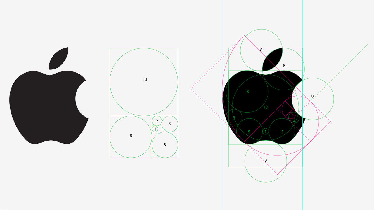
There are many rumours spread around today that certain logos of massive modern day products such as apple
been designed intentionally around the golden ratio and therefore this is the reason for their popularity (this was
later asked of the designer in an interview and he confirmed it was never even thought about in the designing stage).
Jan Tschichold, a revolutionary on the subject of the golden ratio once said "There was a time when deviations from the truly beautiful page proportions 2:3, 1:√3, and the Golden Section were rare. Many books produced between 1550 and 1770 show these proportions exactly, to within half a millimetre".

The reasoning behind this theory if often challenged by non-believers and what I believe is quite accurately, how can a ratio between two numbers signify something being aesthetically pleasing as this is a subjective matter and what is aesthetically pleasing to one person may not be to another?
The next theory principle that I will look at for inspiration of canons of page construction is the Van De Graaf canon. The Van De Graaf canon is another method of page construction that can be seen to be used for a long long time. The historical method of page construction popular for its use in editorial design in which the page proportions are said to be aesthetically pleasing. Evidence of its use can be seen as far back as in medical scripts and even books as old as 500 years old. The canon works only as part of a double page spread where the proportions of the page are divided up so that the width of the page is directly linked to the height of the text area and the outer constraints of the text area are decided by the dimensions of the page, this coming together to indicate where the contents of the page in the editorial design should be positioned on the page. The layout causes pleasing and functional margins of size with 1/9th on the inside of the text area and 2/9ths on the outer margin of the page, the red area on the page below is the area in which the content is placed.

Similarly to the Van De Graaf canon but discovered much more recently a man called Raul Rosarivo decided to look at a series of old books by great literary and great artist like Johannes Gutenberg found a pattern between all of the writing and this was that when the pages of his, any many other's books were split in to a nine by nine grid horizontally and vertically by using diagonal lines and a circle to denote the height of the content area the cells would be divided up perfectly to creat the similar 1/9th margin on the inside and 2/9th margin on the outside we are some familiar with from the van de graaf canon.

I then partook in an example of first hand research in which we were told to find articles that I took from online and to analyse these two different articles on the grid structure they use. The first of these that I am looking at is the columnar grid that is the main grid type used traditionally in the majority of newspapers and articles etc. This grid structure splits the page in to a number of columns in which text and image an be place and used as a wit to split up a page. The column space is determined by a number of other factors such as the outer margins of the page ad the gutters between the column, this allows massive of text to be displayed in nice uniform column with the use of an occasional image to break up the text.

Similarly to columnar grids modular girds also use column spread apart by gutters and surround by margin to creates uniformity in editorial design when laying type and image in a layout but also on top of this has horizontal rows in the grid that are spread apart by gutters also. The small square sections created by the dividing of the page by the horizontal and vertical gutters creates what it knows as a module, this is where thee modular grid name comes from. This unlike a columnar grid allows the designer a lot more ease when designing as it provide a lot more possibilities of areas in which text an image can be placed.

No comments:
Post a Comment